

Reading Baemin’s typography before turning it into DESIGN.md
Separate brand lettering, conference typography, and a dated app rebrand, then turn those references into decisions for your own product.
A request to make a page feel like Baemin can quickly become a mint palette and an expressive heading. A useful design brief goes further: it records where a typeface appeared, what job it did, and which decisions still belong to the new project.
Baemin, the Korean delivery service, offers an instructive example. Its public font catalog, a technical article about conference typography, and an app rebranding announcement describe different uses of type. Keeping those contexts intact makes the reference more useful to both designers and coding assistants.
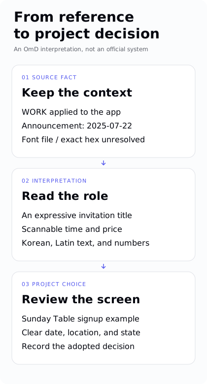
Figure: the dated WORK announcement, the role-based reading, and the Sunday Table decision, kept apart.
A recognizable voice has different jobs
The official font catalog describes lettering influenced by signs and explains why Hanna Air was developed for body text: people had been using the stronger Hanna heading face in longer passages. Even within one brand, an expressive title and a paragraph can need different treatment. Official font catalog
The 2024 Kkubulim announcement adds another part of that history, describing loose, irregular curves and a connection to older signage. The background helps explain the character of the letters. Kkubulim announcement
Our application of these references is to assign expression a specific role. An invitation headline can carry personality. Dates, prices, and application deadlines need to be easy to find and compare. Repeating the headline’s treatment across every detail may weaken that hierarchy. This is an OmD interpretation for a new project, rather than a quoted rule from Baemin’s UI system.
Keep the surface attached to the evidence
In November 2024, Woowa’s technical blog described Interop, which combines Inter with adjusted Noto Sans Hangul. The article discusses its use on the WOOWACON 2023 and 2024 websites. It is a useful case for studying how Korean and Latin text work together. Interop development article
A reference can preserve that conference website decision. Assigning the same face to Baemin’s app body text would extend the claim beyond its source. Shared company ownership does not establish shared typography across products and events.
For your own page, prepare mixed content before choosing type. A line such as 일요일 12:30 · 2인분 · 8,000원 brings Korean text, time, quantities, and currency together. Check wrapping and alignment with that content. An attractive alphabet specimen on its own rarely reveals these problems.
Record a rebrand with its date
On July 22, 2025, Baemin announced that a brighter mint color and a new typeface, WORK, had been applied to the app. The announcement describes simplified diagonal Hangul strokes and a plan for gradual UI/UX changes. That provides dated evidence of product use. Baemin 2.0 announcement
DESIGN.md can retain WORK’s name, the stated characteristics, and the announcement date. The same source does not establish an exact current color value or the font used for every piece of text in today’s app. The terms for publicly distributed font families also need to be checked against the named files. This article does not redistribute WORK or display another face as a WORK specimen. Official font terms
A missing font file does not erase the useful history. Preserve the verified description and omit the unavailable specimen or unresolved token. Readers should still be able to understand what changed and where the evidence ends.
Move from reference to project decision
The following table is an editorial example, not a machine-readable Core schema.
| Layer | Record | Use |
|---|---|---|
| Source fact | A July 22, 2025 announcement states that WORK was applied to the app | Preserve the name, date, and product context |
| Interpretation | Distinguish expressive headings from information people scan | Review titles, times, and prices separately |
| Project decision | Give an event title and signup details distinct visual roles | Inspect the rendered page, then record the adopted choice |
A prompt can make those boundaries visible:
Use Baemin’s public material as a reference for the different roles
of expressive headings and readable body text.
Our product shows the schedule and signup details for a neighborhood meal.
Design the hierarchy of the event title, date, location, and signup state.
Do not infer unverified app tokens. Propose choices for this project.
Record the selected typography and colors in the project design document,
then review the rendered screen.
Apply it to one small screen
For an original example, imagine a neighborhood meal called “Sunday Table.” The title invites people in. A separate information group carries the date, location, and availability. The button names the signup action, and the same area communicates when registration is closed.
The test is concrete: can a first-time visitor find when and where the meal takes place, understand whether they can join, and see what changed after the action? Repeat that check on a narrow screen and with a longer event name. The example is OmD’s own design exercise, not a reconstruction of an official Baemin interface.
When collecting a reference, keep its visual character and its original job together. Choose a company in Builder, then distinguish the facts you are carrying forward from the choices your new project still needs to make.
OmD is also preparing a skill for Hangul typography.